IDENTITY
Defining
recognition.
We build the system that makes your brand instantly recognizable, wherever it appears.
EXPERTISE
FRAMEWORK
-
Brand systems establish the structural foundation of an identity.
Typography, colour, and form work together to create a coherent
visual language. -
Typography defines tone, hierarchy, and readability.
It becomes one of the primary elements through which the identity communicates. -
Visual language establishes the forms, compositions, and graphic elements that define the brand’s expression.
-
Applications translate the identity system into real contexts — packaging, print, environments, and digital surfaces.
-
Brand guidelines document the identity system and ensure consistency across all implementations.
The structure that defines how a brand takes form.
SYSTEM
Brand identity translates direction into form. Typography, composition, and colour establish a coherent visual language — one that works across every surface,
at every scale, in every context.
Built once. Yours forever.
APPLICATION — SELECTED PROJECT

Identity / Direction
6AM is a premium electrolyte sparkling water, understated by design.
The identity system is built on restraint, proportion, and typographic precision.
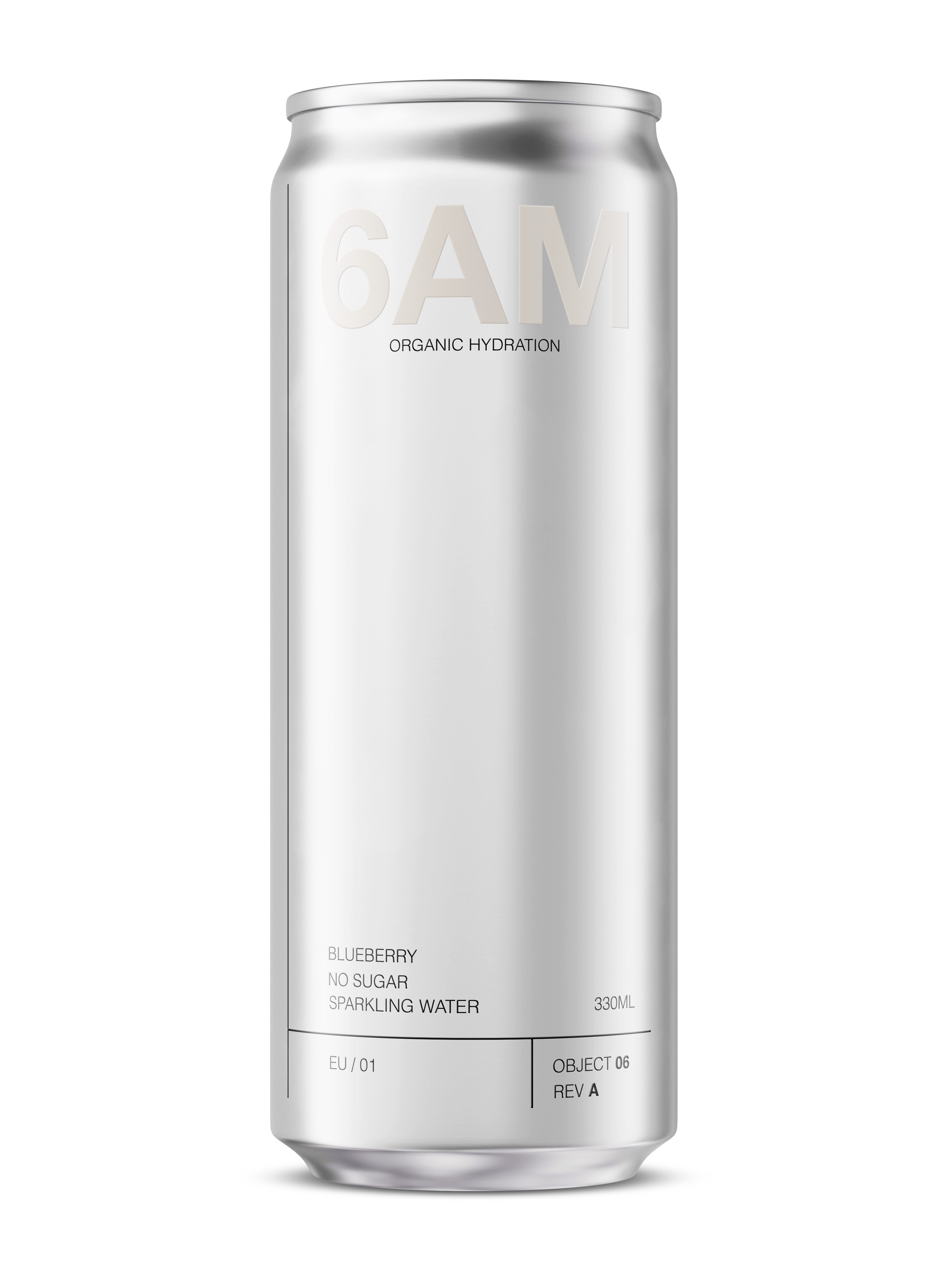
Primary mark
Brushed aluminium
Information band
OBJECT 06
330ML CAN
Identity and packaging system
PRINCIPLES
IDENTITY SYSTEM
+ Identity reduced to its structural elements.
+ Large-scale typography defines hierarchy.
+ Fine lines establish proportion.
+ Negative space carries weight.
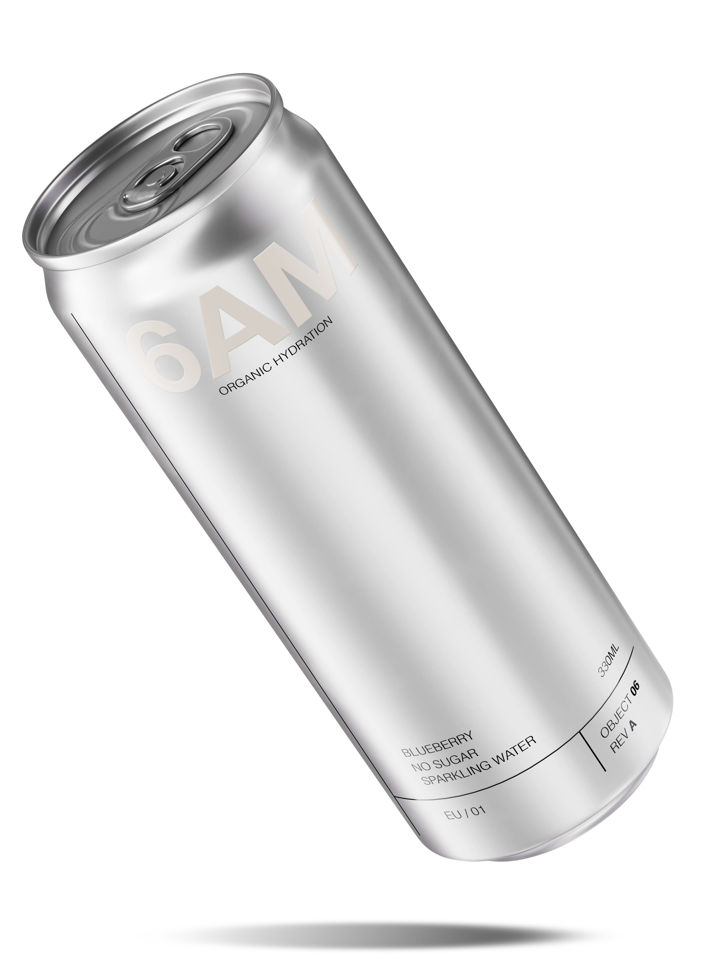
Mark
Subline
TYPOGRAPHY &
GRID
+ A modular grid governs placement and spacing.
+ Primary type establishes hierarchy.
+ Secondary information aligns to a defined baseline.
Product info
Code system
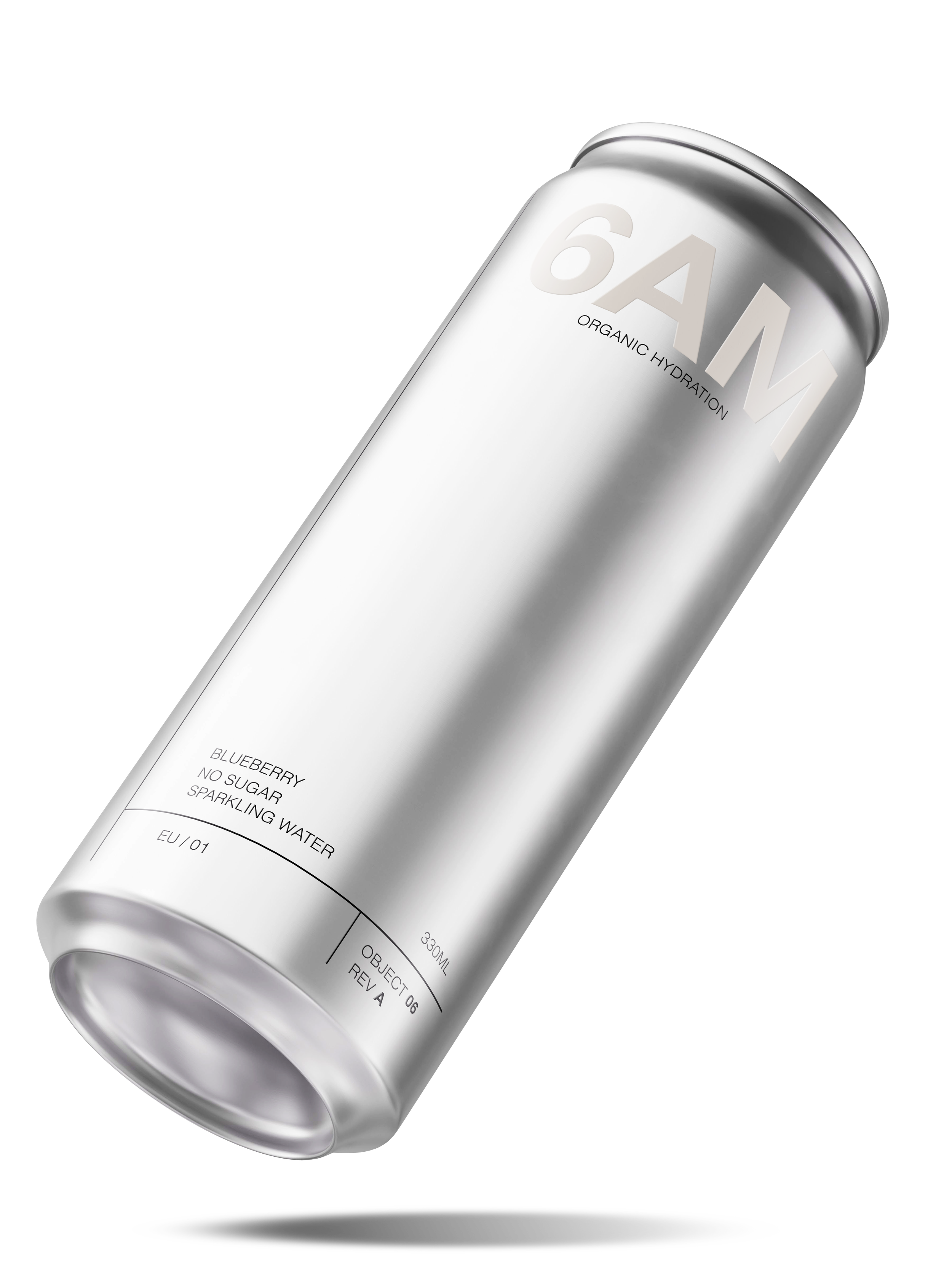
MATERIAL EXPRESSION
+ Raw aluminium reinforces neutrality.
+ Tone-on-tone typography ensures subtle presence.
+ The object remains understated in context.
EXPRESSION
Packaging is identity in physical form.
RESULT
A brand that doesn't need to
explain itself.
On every surface, in every format,
unmistakably yours.